
Step By Step Guide: On How To Make Toast
- Toaster and bread should be placed onto a clean counter top.
- Plug in toaster, and turn on power socket.
- Choose toaster setting of temperature depending on preference, recommended to turn dial half way for golden brown toast- the higher the dial, the darker the toast.
- open bread packet.
- Take out two slices of bread for a standard two slot toaster.
- Place pieces of bread into the slots of the toaster.
- Pull down on lever on the side of the toaster, to pull down bread into toaster.
- Wait a few minutes depending on your choice setting, until the pieces of toast spring up in toaster.
- Once the pieces of bread are toasted, and have popped out of the toaster, you can now grab your pieces of toast.
- Place pieces of toast on a plate, and choose your preference of spreads or fruits.
- Once you have applied your choice of flavour to your toast, you can sit down and enjoy your delicious toast that you made all by yourself.
How To Make Toast: Flowchart

Toast Sitemap and USER FLOW

TOAST GRID AND WIRE FRAMES


TOAST USER INTERFACE (UI)


Mini Storyboard

Precedent presentation
By Natasha, Teya, & Connor.
MetEye

What is the interactive about?
Our interactive is a government website with different forecasts that can be clicked on and changed. It also features a couple of other interactives covering current events happening (or not happening) in Australia such as tropical cyclones and tsunamis. it also showcases various portals of information when you click on a specific topic (CLICK ON MARINE AND OCEAN) such as sea temperatures and currents, and interactive weather and wave maps.
Who is it designed for? (Target audience)
It is designed for a diverse range of people e.g.
– People who would like to become more aware of their environmental surroundings, not only on a local level but on a national level as well
– People such as fishermen or surfers, looking for tide predictions and wave height expectancy
– People who live in cyclone prone areas, in order to stay updated.
What knowledge does it assume of the target audience I.e. digital literacy?
Geographic terminology, assumes the user will know how to use and read different types of interactive maps
Describe the type of user interactions, and the user interface.
The interface consists of a multi-faceted map that has different indicators which you can click back and forth from (CLICK ON DIFFERENT FORCASTS) Interactive weather and wave forecast map (CLICK ON MARINE AND OCEAN ANG THEN ONTO INTERACTIVE WEATHER AND WAVE MAP) Allows you to click through the forecast for total wave height and direction for the current week Temperature forecasts indicated through spectrographs, with actual temperatures and what they feel like rounded to three-hour intervals, daily and overnight maximum temperatures; overlays include rain radars and mean sea level pressure (CLICK ON FORCAST) Rainfall forecasts showing the chances of rain on one day and the next indicated by spectrographs, can be filtered down to minimums of 10%, 25% and 50%; overlays include latest rain radars and mean sea level pressure (CLICK ON FORCAST) UV index forecasts shown in spectrographs and rounded to either daily or three-hour periods, overlays include rain radars (CLICK ON FORCAST)
What can you say about the visual design, layout, colour, and typography? – How would you describe the style?
Very flat layout, nothing exciting or engaging. The colour choices are quite dull and do not do a good job of adding to the aesthetic element of the website.
They choose a very basic sans-serif, which makes sense for the site functionally speaking, however there could have been more variation in fonts possibly switching between a font for headings and a font for larger bulks of text
What improvements would you suggest?
– Changing colour and typography for title, subtitles and paragraphs respectively
– Making the website more responsive and take more into consideration the user experience (CHANGE TO MOBILE VERSION)
– Adding air quality indicator to the actual interactive
– Adding more colour range to the legend instead of shades of the same colour for better interpretation and also to be more inclusive (i.e. factor in people who may be affected by colour blindness)
– Possibly adding an index/ a definition when you hover over certain words
ASSESSMENT TWO IDEA NOTES
WHAT
The Sustainable Life Project is an interactive website that intends to educate, aware and inspire audiences to help guide a sustainable lifestyle, that adapts to conquer environmental concerns, focusing on eliminating waste. The website will contain a plan of action of the sustainable life project and allow users to set personal goals; through guided elemental modules, audiences follow the process of sustainable living, through educating- learning the reason, advocating- finding a change and experiencing a journey of critical change. The website will provide a range of resources, including:
- How to reduce waste- in all aspects of lifestyle e.g. cooking, cleaning, storage etc.
- How to reuse materials and products.
- How to make resourceful and healthy recipes, without packaging and waste.
- Information on recyclable products and sustainable stores that provide environmentally friendly packaging and products.
- A progression scale to measure the difference of lifestyle when starting the sustainable life project.
- Detail on different types of rubbish and their effects on the ocean environment and ocean creatures.
- A project blog to allow audiences to interact and share their personal experiences, recipes, pictures, information and discuss the project together.
WHY
The motivation behind the Sustainable Life Project website is to spread awareness of the importance of innovative and revolutionary lifestyle concepts that can help change waste production and pollution in oceans, making a huge impact on ocean environmental stress, sea creatures, pollution and destruction of ocean ecosystems. The website is to logically explain and explore the cycle of waste enforcing a moral lifestyle change.
HOW
The Project is reaching audiences about waste, ocean environment crisis’, ocean creatures and sustainable living, through interactive media and design on a website layout basis, that is easy to access, explore and produce positive audience interaction with content. Through interactive images, allows the viewer to easily browse through the large amount of information, and interpret the knowledge behind the visuals. There is straightforward navigation to each concept of the site, and follows through modules and comparison scales to monitor the audiences progress, as well as share updates and comments with the Sustainable Life Project Community. To join the Sustainable Life Project, audiences simply create a unique username and click ‘Start Journey’, the interactive website will automatically save progress as audiences browse content, for example- once an elemental module is complete, it will turn green. As audiences progress through the elements of the project, they will be rewarded with points that they can redeem for either a voucher for sustainable and recyclable stores and products, or audiences can choose to donate to charities advocating for cleaning oceans, saving ocean creatures and eco-friendly companies.
WHERE
The Sustainable Life Project is an open and easily accessible website platform, found through internet sources. The site can be accessed via tablets, laptops and desktops. The resourceful website can be accessed at any time through internet availability, with all module content free to explore and share with others.
MINDMAP


DAVEO MOODBOARD


USER PERSONAS AND MOOD BOARDS


user scenario descriptions
NOVICE
- The user is a novice – For an interactive web design suited to beginners, there would be an option to change interface interaction to accommodate to those new to the site. There will be hover instructions and terms to help guide the user and provide an understanding as they work through the site.
- A novice user may be using my website to research innovative way to introduce to their lifestyle to reduce waste, they could easily access this with primary navigation, by clicking on the nav bar and selecting “Lifestyle”, the user will need to know selection is made by clicking regardless of the highlighting of the word. Once they click on to the page, subheadings and interactive pictures are used to translate the function and colour schemes are used to distinguish concepts of information listed. These features allow a novice control and flow when using the product, without categorisation and hierarchy, information overload would distract novice users.
EXPERT
- The user is an expert – For an expert user there would be a pro version to click on, that provides the content and details without extra instructions floating upon content sections, allowing a easily useable and fuss free interaction for users who already understand the run down of interactive design.
- A expert user may use my website to track local sites that deliver recycled products to suit they converted lifestyle. An expert use would know to locate “Friendly Companies” on the navbar menu. Once that page is selected, an interactive step would be required from the user to provide location details, with the search the site will bring up local recyclable and cruelty free products, companies and online services. An expert user would know how to pinch the map to zoom in and out, and how to click on the options to view more information.
COMBINED USER PERSONA’S MOOD BOARD

SITEMAP FOR ASSESSMENT – THE SUSTAINABLE LIFE PROJECT

WIREFRAMES


USER FLOW
User Scenario Examples:
- A university student- Odin lives in Byron Bay and is aware of the oceans pollution and has recently moved into his first apartment and would like to live sustainably, but doesn’t know where to start or where to shop. Odin realises the best way to find sustainable shops is to look online, Odin searches ‘sustainable living’ into google and clicks on The Sustainability Project, where he is directed to the homepage and reads ‘About Us’, realising that’s what he is looking for. Odin provides a user name and browses the content, finding locations and services of local sustainable stores, where he purchases the products to start up his new journey of sustainable living. The detailed interactive videos has also helped Odin save money through recycling, whilst budgeting living out of home and balancing student responsibilities.
- A married couple- Cosmo and Jade recently had twins Luna and Indigo and have decided to uptake a sustainable lifestyle to ensure a positive environment for their twins. Cosmo and Jade did some online research on how to get started and stumble across The Sustainable Life Project. Cosmo and Jade find the progress bar and colours to be very helpful, as they can only watch the modules for 20 minutes a day due to their busy family life. They find it particularly helpful in earning vouchers to cater to their families wellbeing and lifestyle. Through the website experience they have learned about ocean pollution and now volunteer in rubbish clean-ups at their local beaches, setting a positive example to their growing family.

SCREEN DESIGN LAYOUT IDEAS


INTERFACE SCREEN DESIGNS


FEEDBACK SHEET

Review Sheet: phase 1


REVIEW SHEET: LOGO/TITLE


BEFORE


AFTER

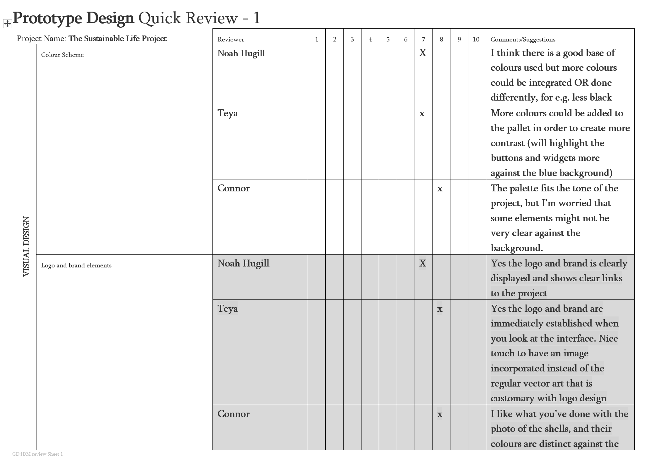
review sheet: PROTOTYPE DESIGN quick review 1


BEFORE AND AFTER


