
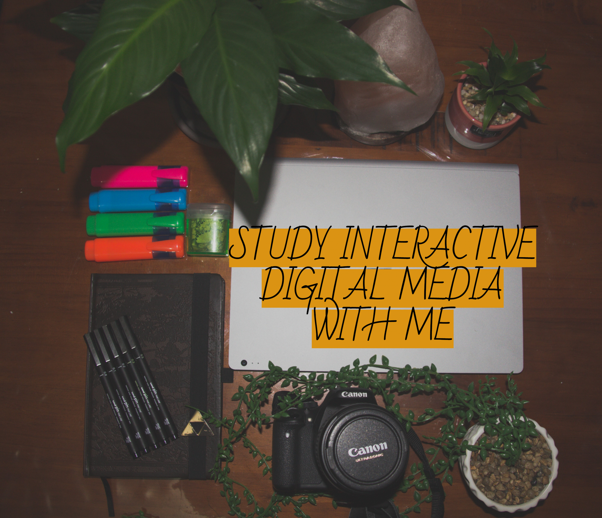
Week One Introduction To Graphic Design: Interactive Digital Media
Interactive Design can be defined in numerous ways due to the varying experiences and ideas based around the concept. Roger and Preece Sharp say “Designing interactive products to support people in their everyday and working lives”, whereas Winograd says “The design of spaces for human communication and interaction.” Both validating points and therefore a clear explanation of the varying technologies and design strategies available.
Interactivity represents many aspects, including- of or relating to a program that responds to user activity, working together so the total effect is greater than the sum, and capability of acting on or influencing each other.

Examples of everyday interactions- vending machine, mobile, online internet resources, a book or conversation.
In interaction our wants, needs, and desires have an effect or response that can be recognised and understood through eyes, ears, taste, smell, feel or smell. Interactions can be scaled through reactive and engaging reactions. For example great conversation is both reactive and engaging.
Unified Field Theory of Design can be categorised by feedback, control, creativity, communication and adaptivity; on a scale from passive to interactive. These categories are a simple and specified guide on the Continuum’s of Interactivity, researched by Nathan Shedroff.

SUMMARY
- Watching a film or tv show that has no interactivity only results in changing the channel which is scaled on passive interaction, whereas a video game advocates to sight, sound, touch and memory, therefore becoming a more interactive experience.
- Constructive data can flow from data, to information, to knowledge and then to wisdom. Data analysis below represents how this can evolve.
- There are five key design areas used in interactive design which are- Interactivity, Information Architecture, Time and Motion, Narrative and Interface.
- Interactive Design for People by Bill Verplank- ‘There’s are person interacting in the world and getting feedback from the world. There are three questions that need to be answered”, which are:
- How do you? Handles- Continuous Control, Button- Discreet Control
- How do you feel? Cool or Hot Media
- How do you know? Overview and Path
- Gillian Crampton Smith is the leading academic in interactive design taught at schools of art and design. In 1989 she established the first program in interaction design at the Royal College of Art in London. In 2000 she moved to Italy to set up and become Director of the Interaction Design Institute Ivrea, the first institute devoted exclusively to the study of interaction design.
- Interactive Yoga- tabs on History, Benefits of Yoga, Types of Yoga, Pose Analysis and Routine. Features include Pose Instructions, Muscle Focus and Alignments and Planes accompanied by diagrams, video and images. Very informative, categorized neatly and easily accessible.

Figure 3. Waterson, S. (2019). Week One: Introduction to Interactive Design [Screenshot of Podcast]. Retrieved March 10th, 2019, from https://vimeo.com/319375480. 
Figure 4. Waterson, S. (2019). Week One: Introduction to Interactive Design [Screenshot of Podcast]. Retrieved March 10th, 2019, from https://vimeo.com/319375480. 
Figure 5. Waterson, S. (2019). Week One: Introduction to Interactive Design [Screenshot of Podcast]. Retrieved March 10th, 2019, from https://vimeo.com/319375480.
REFLECTION
Interactive Design is experienced on an infinite scale, that is ever-changing as people grow, trends change and new technologies are introduced. Each individual is unique and will interact differently sight, sound, memory and touch may affect these interactions, its important to consider such concepts and adapt design to fit the needs of specific audiences. Data, information knowledge and wisdom are the key factors to evolving interactivity experiences, this is important to best suit changing trends and growing audiences.
Week Two Lecture Notes: Process & Context
Context for use; Contexts of use- These are two major keys to unravelling the process of your product and design idea to form a collective and completed product.
There is vast variety of questions to consider, it may be exhausting and overloading to the mind, but there are so many outcomes, design principles, materials, functionality and purposes that create a successful product. Without consideration of all aspects of an idea, the prototype and model phase can be even harder to comprehend. By expanding your mind to appropriately engage a high end product with multi-purpose functionality, is a beneficial process. There is a flow of brainstorming, research and practice when creating, although within that flow are smaller paths to consider and render; that will ultimately help reach your end goal and present your ideal physical product that started from a thought process of ideas.

Figure 1. Waterson, S. (2019). Week Two: Process and Context [Screenshot of Podcast]. Retrieved March 11th, 2019, from https://vimeo.com/319375610.
SUMMARY
- Flowcharts, tables, sketches, story boarding and notes help create an objective of context and guide the process of creating an initial idea into functionality and physical form.
- Precedent Research- studying existing products for ideas, observation, interviews, testing prototypes.
- When designing there are key elements to consider to ensure your product is adaptable and fully useful. These elements to consider are:
- What- people are trying to do
- How- they may try to do it
- What- gets in the way or helps
- Where- they might be doing it
- There are also ideal context questions to consider asking yourself when creating that can help ensure meeting all requirements of your product, to appropriately suit your target audiences’ wants and needs. For example:
- What is the situation?
- What’s the setting or environment in which the interface or the device will be used?
- Is it public or private?
- Is it conductive?
- There are functionality questions to consider as well as context. Personal usage can range on a large scale and products should be suited, to ensure proper usage and positive contribution to daily lifestyles. For example:
- Who will be using the device or interface?
- Will it be used by one person, or multiple people?
- How long will the interface be used?
- Will the person be able to focus on their task, or will they be interrupted while using it?
- Does the experience need to be extremely simple?
- How much complexity can be accepted?
- What are the persons needs and goals?
- What are they trying to accomplish or complete?

Figure 2. Waterson, S. (2019). Week Two: Process and Context [Screenshot of Podcast]. Retrieved March 11th, 2019, from https://vimeo.com/319375610.
REFLECTION
Interactivity is build upon an abundance of questions, researching and practice. Before any product can be created, there is a process of questioning everything you possibly can about such product before any prototype can become physical. It is highly important to outline key questions of a product, to completely understand the context, purpose, functionality and production of a product; without mapping, questioning and researching, there is bound to be holes within a product that will not form successfully.
Week Three Lecture Notes – Design Patterns
Design Patterns refers to the compositions and design layout of a product, and differentiating the design patterns to adapt to mobile, desktop, or tablets. Despite responsive designs, there are a range of specifications and ideals in comparison to a desktop or a mobile device.

It is recommended and a buzz word to start with ‘mobile first’, to design to a smaller screen and scale. This basis helps build screen design and unfold bigger changes and adaptions, as well as ensuring popular demand of preferred device is designed for.
Architect Christopher Alexander first mentioned pattern designs in his book ‘ A Pattern Language’ in 1977. Design patterns and interactive design go beyond style and visual repetition, it is merely visual resolutions and software design that encourage a remarkable work flow of adapted design.
A direct quote from Christopher Alexander that depicts a reasonable explanation of pattern design reads as follows “ Each pattern represents our current best guess as to what arrangement of the physical environment will work to solve the problem presented.” As designers in a space, it is our environment that adapts our ideas into reality and functionality.

SUMMARY
- Due to high demand and readily available design sites for business’, designers, artists, or architects, etc, UI Pattern Proliferation represents a huge growth of identical design patterns for websites, layouts and social sites.
- Identical design patterns are popular due to a common way of understanding and interpreting the internet. There are certain layouts that allow audiences to consume such information or content in a effective and informative way, due to display, layout and interactivity. Examples of common design pattern properties are:
- The Hamburger Menu (allows space on screen, designed by Norm Cox, easy navigation for audiences.)
- Account Registration (used to create a flow of process and progress, allows a carefree way to keep track of steps)
- Long Scroll (great for story telling on websites, apple watches and simple navigation)
- Card Layouts (pioneered by Pintrest, presents information in chunks and helps scanning and rearranging information easily, provides simple and straightforward titles, content and pictures.)
- Hero Images (high definition images to grab audiences attention, allows a simple representation to identify content or product to audiences.)
- Animation (commonly used to enhance site storytelling, and to add an element of interest and interactivity to a site, there are large scale animations with parallax scrolling and pop ups notifications, or there are small scale animations with spinners and hover tools or loading bars that don’t require any user input.)
- Navigation & Menus Animation (hidden navigation menus are very popular to save screen space, hover navigation gives an intuitive feel and gives instant visual feedback; usually used for desktop, laptops and tablets.)
- Gallery & Slideshow Animations (used to add large sums of content imagery in interesting and interactive displays, used especially by photographers for portfolios.)
- Motion Animation (add intrigue and attention, as audiences are attracted to motion.)
- Scrolling & Background Animation/Videos (creates audiences interaction and adds depth to websites to represent content and an essence of aesthetic design.)
- Material Design (introduced by Google in 2015, used with shadow effects, movement and depth concepts to create design that’s more realistic to the user with clean and aesthetic design.)
- Responsive Design (very popular due to mobile usage and design, usually minimalist to keep website size low, and create structure and flow of the design on a range of products.)
- Flat Design (compatible with minimalist design, material design and responsive design, as its patterns are used for simplistic and aesthetic design concepts.)
REFLECTION
There are endless possibilities to approaching design patterns to emerge your desired product vision. There are countless layouts that have already been adapted and tested to be successful in the interactivity and response of a product, this is due to popularity of preference, especially mobile phones; most product would be adapted to suit a mobile layout first, then adapted for other devices. Design patterns are important to follow to ensure productivity of a product, meeting trends and audiences expectations. Following pattern designs also ensures skills and knowledge to appropriately plan and design a product.
Week Four Lecture Notes – Instructional Design
Instructional Design can be defined as how to “do something”, or to explain “how something works”. This can explored in various ways, as long as the aim is succeeded through interactive flow.

Figure 1. Waterson, S. (2019). Week Four: Instructional Design [Screenshot of Podcast]. Retrieved April 5th, 2019, from https://vimeo.com/319375981.
Instructions- help navigate, inform and create productivity with a product. Instructions can be a numbered list, directions, pictures or a combination of text and pictures. Instructions can be found at a variety of places, for example working sites may have safety instructions on how to use a tool or a hospital may have a step by step guide on how to properly cleanse an area.
SUMMARY
There are a range of approaches to construct instructions, they form and layout of instructions are key to how a person may interact, interpret and understand the instructions provided. Examples of instruction layouts include:

- The Split-Attention Effect: A person must hold lots of information in working memory, and then be able to marry together and interpret the text, images and legend to portray the graphic.

Figure 3. Waterson, S. (2019). Week Four: Instructional Design [Screenshot of Podcast]. Retrieved April 5th, 2019, from https://vimeo.com/319375981.
- Finding a balance of hierarchy, visual features, and text is very valued for the importance of effective clarification and analysis of the information provided. In terms of the before and after example, the first was less effective to audiences to the lack of flow and layout, the structure of the instructions made it appear busy and overwhelming to interpret. Whereas, the after layout was much more effective to its open space and layout catering to a visual hierarchy, the diagram allowed a flow of objective, making it easy to process and progress through with a visual perception of direction.
- An instructional guide using pictures is practically difficult for audiences to interpret, as an image can be very complex and busy, making it a prospect of multiple perspectives, making it hard to understand the correct direction the picture is trying to show. Example Below:

- Kinds Of Interactions: users may have a varying experience with products based on the interaction. Types of interactions may include:
- Instruction by clicking on buttons
- Conversation back and forth dialog
- Manipulation drag and drop elements
- Exploration open, playful, game like
- Challenges of Interactive Media Design
- Limited screen area
- Limited resolution
- Opportunities of Interactive Media Design
- Time
- Layering
REFLECTION
When creating instructions to use a particular product, its important to include every precious detail, this is important to ensure an the aim is delivered and achieved successfully through the flow of instructions. Its important to analyse exactly why, who, what and where the instructions are intended for. Using hierarchy, flow, patterns, and visual communications enables how effective and successful instructional design will be.
Week Five Lecture Notes – Personas
User Personas have been used since the mid 1990’s. Allows validation of our design ideas and form, and ensure a clearer vision of accommodation design concepts to target audience and particular usage. User personas is a representation of the goals and behaviour of hypothesis group of users collected from data.
The Inmates Are Running The Asylum by C, Cooper explores the concepts of personas, since 1995 Cooper engages on specific engagement with the user and the software. Cooper outlines the general characteristics, users and best practises for creating personas, recommended that design is used for single archetypal uses.

Figure 1. Waterson, S. (2019). Week Five: Personas [Screenshot of Podcast]. Retrieved April 5th, 2019, from https://vimeo.com/319376194.

Figure 2. Waterson, S. (2019). Week Five: Personas [Screenshot of Podcast]. Retrieved April 5th, 2019, from https://vimeo.com/319376194.
SUMMARY
- When creating user personas, its important to include main factors, such as- age, sex, occupation, hobbies, likes/dislikes, skills, goals, behaviour patterns, and attitudes/opinions.
- The goal in examining these details, is to clarify the mindset, goals, needs, and desires of each personality that may influence the production and design of a product, to best suit their connection to the product.
- User personas allow a clear vision in mind to maintain control on design flow, which would otherwise become difficult without a target audience direction. It is specific and allows a better understanding of the user base.
- User feedback allows room for improvement and better efficiency of the design and experience of your product. Especially since every individual has a different perspective when using products, allowing diversity of information and insight.

- ‘Meet The Users Where They Are’ refers to accommodating a product to a user’s preference. Although there is a diverse range of product option to stream other products, the mobile should always be accommodated for.

- Users who may want to browse on a platform site or may not want to browse, have options of design view for the software. This is a design option to accommodate to the viewer and help guide the user flow.

- Mental Models are the ideas people form based on an activity. For example a teenage boy taking down a note may use his smartphone, whereas an elderly person may use a notebook. Mental Models help shape design.
- Artefact Personas may help the proposed visual product based on aesthetic subjective opinions. Allowing a personality to the product.

REFLECTION
User Personas are key elements in implementing the functionality and overall design of a product. The initial purpose of creating products is for audiences to interact and experience. When meeting specification of a product, it all comes down to how your specific user persona will engage with your product. Creating a character for your product, helps capture the essence of a product, that will appeal to a user. The concepts user personas help indicate and manage of a product, are extremely important in successfully reaching out to target audiences and your product making a lasting impression.
Week Six Lecture Notes – Scenarios
User scenarios are the stories your personas act out, to provoke thought to find out how your users will experience a product to achieve the desired goal. Whether there is a win or fail from the outgoing act, it still gives an idea of how a persona will interact with a product; and outline the complications and resolutions.
Discovering the Who, What, Where, Why, and How factors of the usage of content is explored through scenarios, mind mapping and personas. Exploring these factors will help refine your product.
What’s a scenario? – By The Ux For The Masses
“In the world of user experience design a scenario is basically a story about someone (usually your users) using whatever is being designed to carry out a specific task or goal. For example, a scenario might outline how Paul uses a website to order flowers for his mother’s birthday, or how Sarah buys a train ticket on a kiosk machine for her journey home (goals and context are important). Scenarios can be very detailed, all the way to very high level but should at least outline the ‘who’, ‘what’, ‘when’, ‘where’, ‘why’, and ‘how’ of the usage.”
SUMMARY

Scenario Example:


1. Using a mobile, a download of PDA Airport Guide Files are available, connecting through local wireless network. Finding the local coffee shop on nearby café list, and selecting chosen option.
2. Airport guide shows how to find the coffee shop with map on screen.
3. Following directions, finds the coffee shop and grabs the desired coffee.
4. Needing to get back to the flight gate, using the Airport Guide to locate said gate, and choosing the directions option.
5. Following instructions, back at needed location with goal achieved.
Now understanding how user will use the product, outlines the specifics of the product.
Identifying functions to achieve goals, determines what needs to be prioritised on the interface.
Examples of list and map design to achieve desired goal for example persona and scenario.

REFLECTION
The vast amount of research, questioning, mapping and exploring that is conducted when creating a product can become overwhelming, and will need refining to outline key points of content, images, layout and interactivity. Scenarios guide in identifying the main elements that will be represented and defined within your product. The importance of scenarios rules out the most significant components of navigation, content, images, layout, and resources that ultimately define the product for successful interaction.
Week Seven Lecture Notes – User Interface Visual Design Patterns
Interface Design is about the features that allow guidance and efficient usage of a website, as well as creating an impressionable layout and flow. A successful layout brings users back to use such product, with balance of design, and effortless interactivity.

When designing a layout for a website, you want all features and outcomes to result in a positive look and functionality. Its important to consider all aspects and function that will ensure a website or app will flow. User Interface and User Experience outlines exactly what interactive concepts will be put in place within your product.

SUMMARY
User Interface design patterns are standard reference points. For example:

- Tabs- Tabs are used in design to form structure and contain loads of information whilst saving room on the screen. The design idea came from actual tabs in a filing cabinet. The idea also represents skeuomorphism, which is the design concept of design objects representing real word counterparts. Tabs might also be used to when information needs separated into sections.

- Dropdown Menu- Used when user needs to navigate amongst a large website. Dropdown menus conceal information and save space. Dropdown menus are used for hierarchical structure, especially with large amounts of content.

- Drawer/Hamburger Menu- Used for quick access of content, space saving and easy navigation, especially on mobile devices.

- Search Bar With Dropdown- Used for very simple and easy flow to find information and content on a website. Allows increased functionality to due to reduced amounts of effort and clicking on the website.

- Big Footer- Quickly access specific features of the site. Used as a shortcut to another site with hierarchical structure, or to outline main functions, links or contacts.

- Home- Especially used for a quick and easy navigation to always trust in when navigating a page, especially a very large and long website. A home button allows an easy passage to refresh, start over, or go back to main content. A safe start for users, especially for those who don’t use websites often. A homepage can be linked through a logo and should be available on each page of a site.

- Breadcrumbs- Used for when a user needs to know their location on the website. When making an order, following instructions or reading through pages of information, breadcrumbs are a bookmark to know where you are, what you’re up to and where you’re going. Breadcrumbs allow greater understanding of the layout and functions of a website to users.

- Carousel- Used to classify information, and allow the user to concentrate on one piece of content at a time. A carousel may be used to represent pictures and can also be used to entice a user by presenting a selection of content. A carousel may be used to save space and keep a simple structure and flow.

- Tags- Allows relevant content to be linked to other content and allow easy access to browse and navigate through various pages.

REFLECTION
User interface visual design patterns plays a significant role in the aesthetic, feel, role and communication of a website or app. Ensuring the most appropriate patterns are used to compel your product design and concept are majorly important to how audiences are going to respond to a product. Design patterns determines the experience, participation, recommendation and projection of your overall ideas, research, experimentation and refining- to finally deliver your product as a whole.
 natashakelly.home.blog